Design Samples for italki
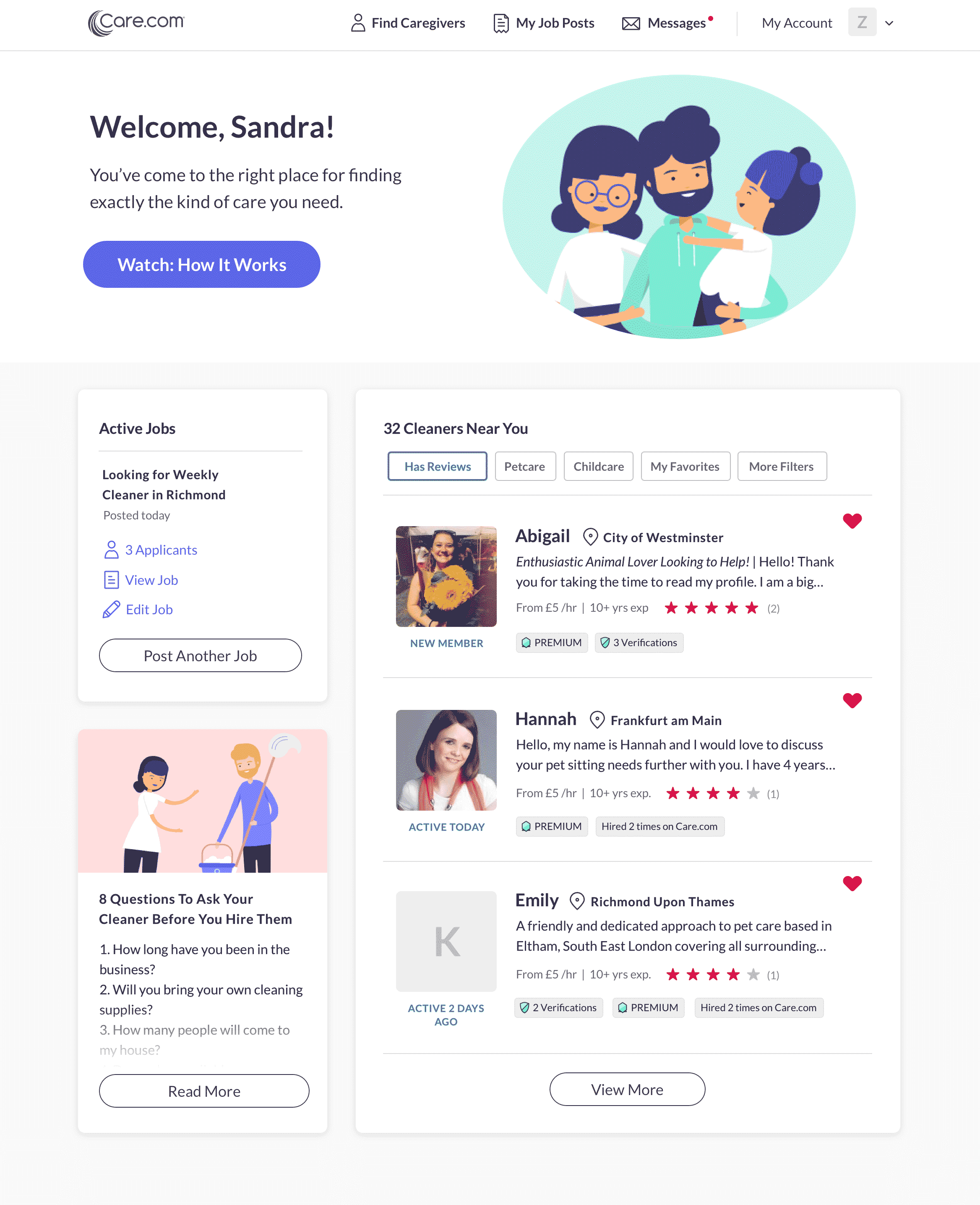
Care.com Visitor Homepage
During my 3 year tenure at care.com (2017–2020), we were continuously experimenting with which homepages performed the best in terms of sign-ups, time spent on site, and premium subscriptions. We did this through A/B testing with tools like Monetate in addition to qualitative approaches like usertesting.com and in-person user interviews. We used a combination new photography, illustrations, icons, and engagement modules (“When do you need help?”, for example).

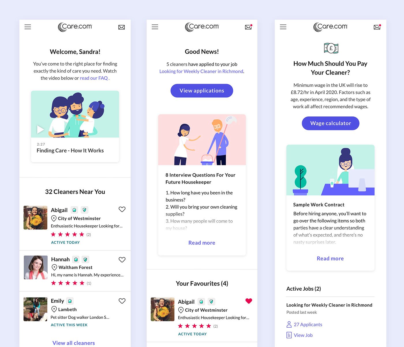
Care.com Member Homepage
We found that the member homepage (what people see when they’re signed in to their accounts), performed better with illustrations rather than photography, although there were regional differences depending on the country we were testing. We tested over 20 countries!
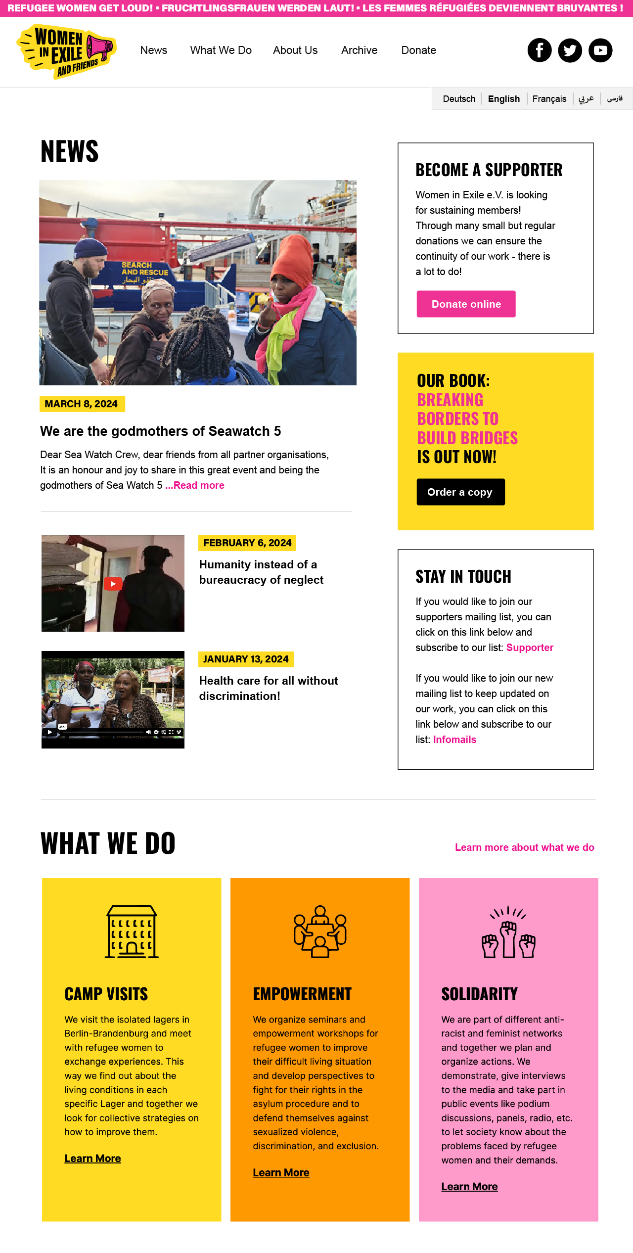
Women in Exile - New Blog
I redesigned a blog website for a refugee women’s group in line with their updated logo (also designed by me, see it here). We worked closely with a developer who showed us how to make updates to different templates and create new templates via their Wordpress admin. The new design brought more donations and also made the website accessible on a mobile device (which it wasn’t before).


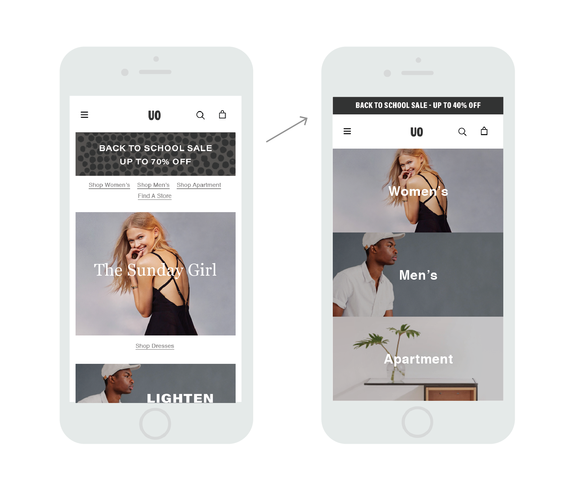
Urban Outfitters - Promo Banner
One of my favourite accomplishments while working at Urban Outfitters was to suggest using a “live” promo banner—made purely of HTML and CSS—which could be easily updated by the marketing team rather than designing and exporting countless different dimensions and languages each time there was an update (which was at least weekly). This saved thousands of hours of production time and the business analytics team reported that it was good for sales as well. They still use this banner today, 8+ years later: www.urbanoutfitters.com